Week 3: First visual tests
- alejandroboutin
- 20 abr 2020
- 3 Min. de lectura
Actualizado: 21 abr 2020
Here are my first visual tests for the project, in which I investigated how I could translate some of the information and knowledge I gained with my research, into typographic work. Things like coexistence, contrasts, the fact of something being hidden or diversity are some of the concepts behind those visual tests, that I first did by hand to then turn them into digital. Here's a mind map in which I summarized the main concepts related to homelessness that I found during my research, and that I wanted to translate into those first visual tests.

Font nº1:
Through this typeface I wanted to show the contrast between how we see homelessness and homeless people and how homelessness really is, but also that duality between how a homeless person sees things and how we see things, almost as if we lived in two different/separate worlds. You can read the type in two different ways: the normal one, and the upside down one.


Font nº2:
Homeless people are often left apart from society, lots of them have very little or even no social relations or contact with other people, and that's what I wanted to show through this typeface, where a bit of each letter is separated from the rest, kind of left behind, as homeless people are.


Font nº3:
Homelessness is a much bigger issue than what the numbers can tell us, notably because of hidden homelessness which is invisible to society and make us think homelessness is a minor issue, that affects a low number of people in our society, when it's actually not, and lots of people are some paychecks away from homelessness. With that idea of something g being hidden or invisible, I made this visual test where I tried to find letterforms inside other letterforms.


Font nº4:
I made this typeface after having watched a VICE documentary called "The homeless crisis is California", that showcased the story of a mother and her daughter who had to sleep in their car every night as they couldn't afford housing in California. The images showed how the two of them lived in their car, packed with loads of things and almost no space to move, which I found was quite claustrophobic, and wanted to translate that into a typeface where letters were really constrained into a space (limiting their width or their length). I think this visual test is the least succesful one as it would have benefited of me limiting the width or the length of the letters much more, almost till those become unreadable. I'll try again this week.


Font nº5:
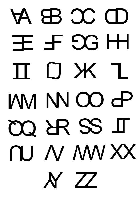
This is I think one of my most successful visual tests of this first week of visually testing. I wanted to translate that idea of coexistence appearing in the film The Florida Project, where loads of homeless people live in motels just some miles away Disneyworld, and how those two extremely different realities coexist in a same space. But this test can also convey the idea of how something can seem something different, in the sense that two letterforms are joined together in one, and this could be read in two different ways, which relates to how society's look on homelessness differs from reality, and even how inside the homeless community there is such a wide range of people and background.
I think it would be really interesting to bring this to a higher level, where there's a much bigger and broader mix of letters, more chaotic, or even more "co-existing".

Font nº6:
As I already said, the homeless community is formed by loads of different people, as I saw in my research, with plenty of different backgrounds, different stories, different situations, etc... Really, there's absolutely no reason of being for a prototype of homeless people, as there really isn't any. That's what I tried to translate with this typeface, made by random objects I found around home, and that I used to create the letterforms.


Comentarios